Product and visual designer with 8+ years of experience, designing for financial institutions, e-commerce, and government organizations.


Alloq
Year
2024
Role
UX Research, UI Design, User Testing
Task
Improve existing feature
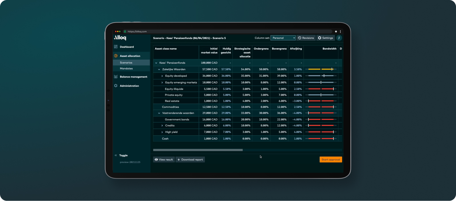
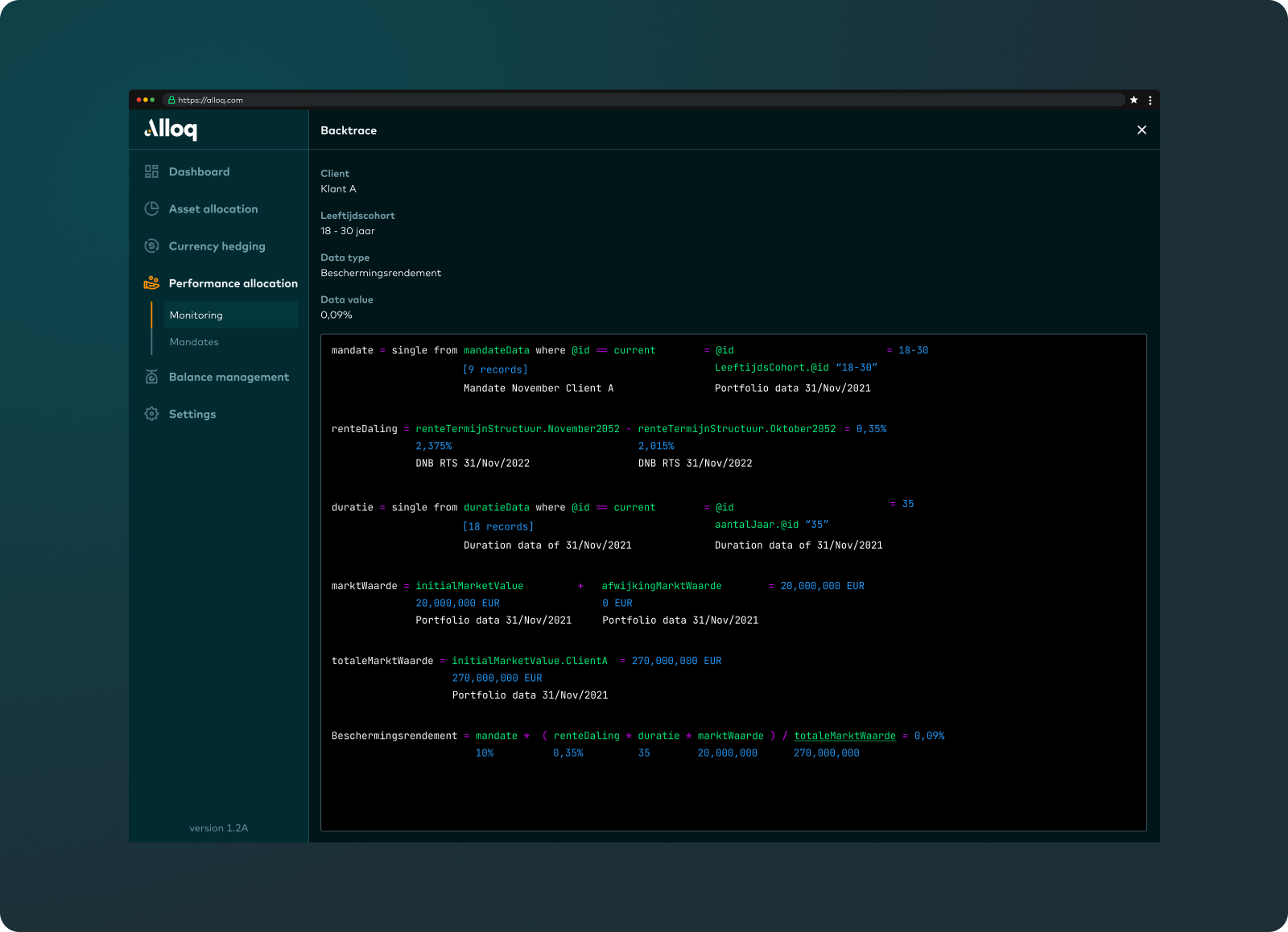
Alloq is a software solution that enables institutional portfolio managers to improve the robustness, speed, and accuracy of allocation management processes such as rebalancing, currency hedging, and LDI. In this case study, we focus on a redesign of the backtrace functionality. This is a feature that allows the end user to trace how a particular value in the table was derived.
Assignment
After receiving feedback from end users and the findings of the development team, we identified several issues with the current backtrace. I was tasked with further investigating this and proposing a suitable solution. We went through the following steps:
Proces
- Documenting and presenting insights
- Facilitating brainstorming and sketching sessions
- Interviewing end users
- Wireframes and sketches in Figma.
- Developing the concept in VS Code.
- User Testing (proof of concept)
Challenges
From the feedback, it became clear that:
- At the moment, it is not possible to drill down to the deepest level, making it impossible to identify discrepancies. The calculations are truncated.
- The display of the backtrace sometimes leads to confusion, partly due to the naming conventions and structure, which negatively impacts user-friendliness.
Besides our curiosity about the current use of this function by end-users and addressing the previously mentioned problems, we also wanted to investigate if there is any untapped potential in this functionality.
Sketchsession
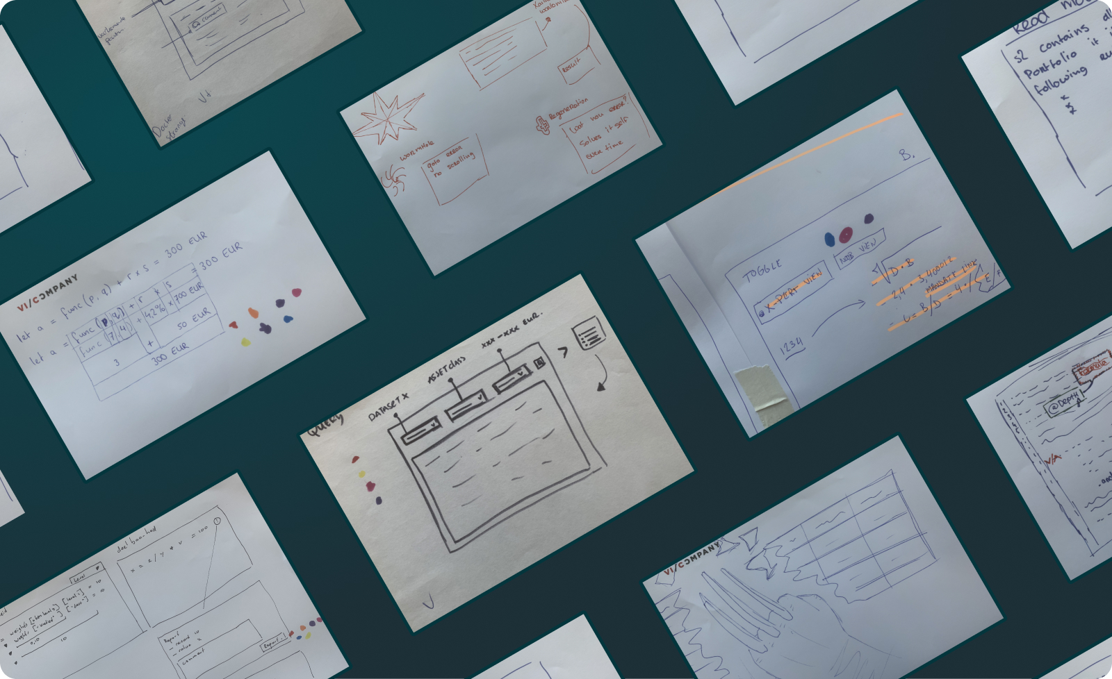
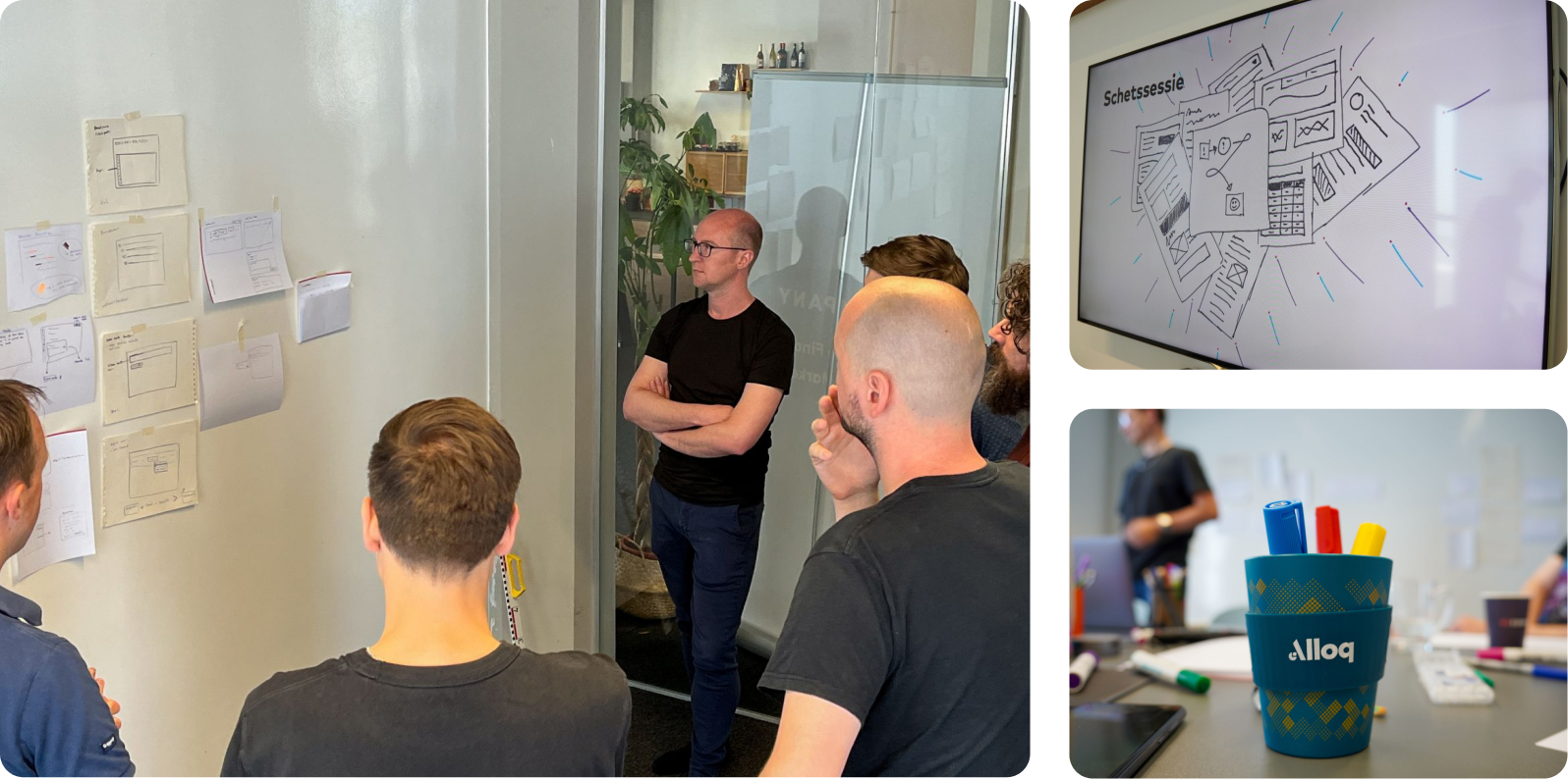
Based on the use cases, I identified three core themes to improve the backtrace, namely: findability, understandability, and shareability. These themes are divided into different rounds, namely:
- Round 1 - Findability: In what way will the user utilize the backtrace to locate the deviation?
- Round 2 - Understandability and Shareability: How can we make the backtrace accessible to everyone? Is it possible to share the backtrace, or specific elements of it, in an understandable way between colleagues? In other words, what happens when someone discovers a deviation?
- Round 3 - Superhero: In this phase, everyone selects a superhero and tries to visualize in a creative way how this superhero would approach the backtrace.
In each round, every participant has the opportunity to briefly present their sketch. At the end of each round, we vote on the solutions we see the most potential in. The findings are then documented and serve as input for developing prototypes.
Insights
After the sketch sessions, the conclusions and sketches were recorded and translated into guidelines for the design phase. The following points were included:
- Using query filters to support users in delving deeper where necessary.
- Distinguishing between user types and aligning the backtrace display accordingly.
- Simplifying the backtrace by initially hiding complex data and providing an option to delve deeper.
- Providing more clarity and guidance in the backtrace. What do the values mean, and what is the source?
- Developing additional tools to capture a complete workflow when finding a deviation, such as reporting, adding comments, history, highlighting, and sharing links to the backtrace.
In each round, every participant has the opportunity to briefly present their sketch. At the end of each round, we vote on the solutions we see the most potential in. The findings are then documented and serve as input for developing prototypes.
Iterate & validate
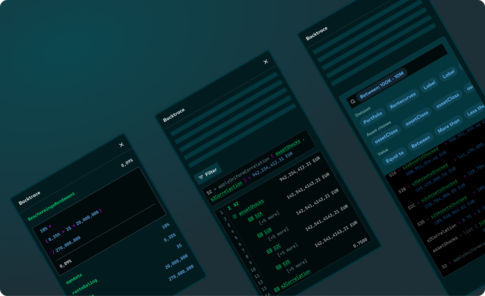
In Figma, I developed various sketches, mainly as experiments to explore and assess whether the proposed solutions are effective. Over time, these led to composite versions or even simplified variants. Together with the development team, we chose one of the iterations, which I then tested with end-users.
To approach it from a more holistic perspective, I initially conducted an interview. I wanted to investigate how they previously worked and what they actually consider crucial when tracing deviations. Additionally, I formulated three statements that I wanted to verify.
- Statement #1: Although the backtrace looks technical, users do not find it complex or unpleasant and prefer not to avoid it - False.
- Statement #2: The backtrace is not readable - True.
- Statement #3The backtrace is not traceable - True.
An interesting insight was that although they initially considered the backtrace complex, they found it very useful once they understood it. This insight led to a new iteration, which was again tested with end-users.
Result
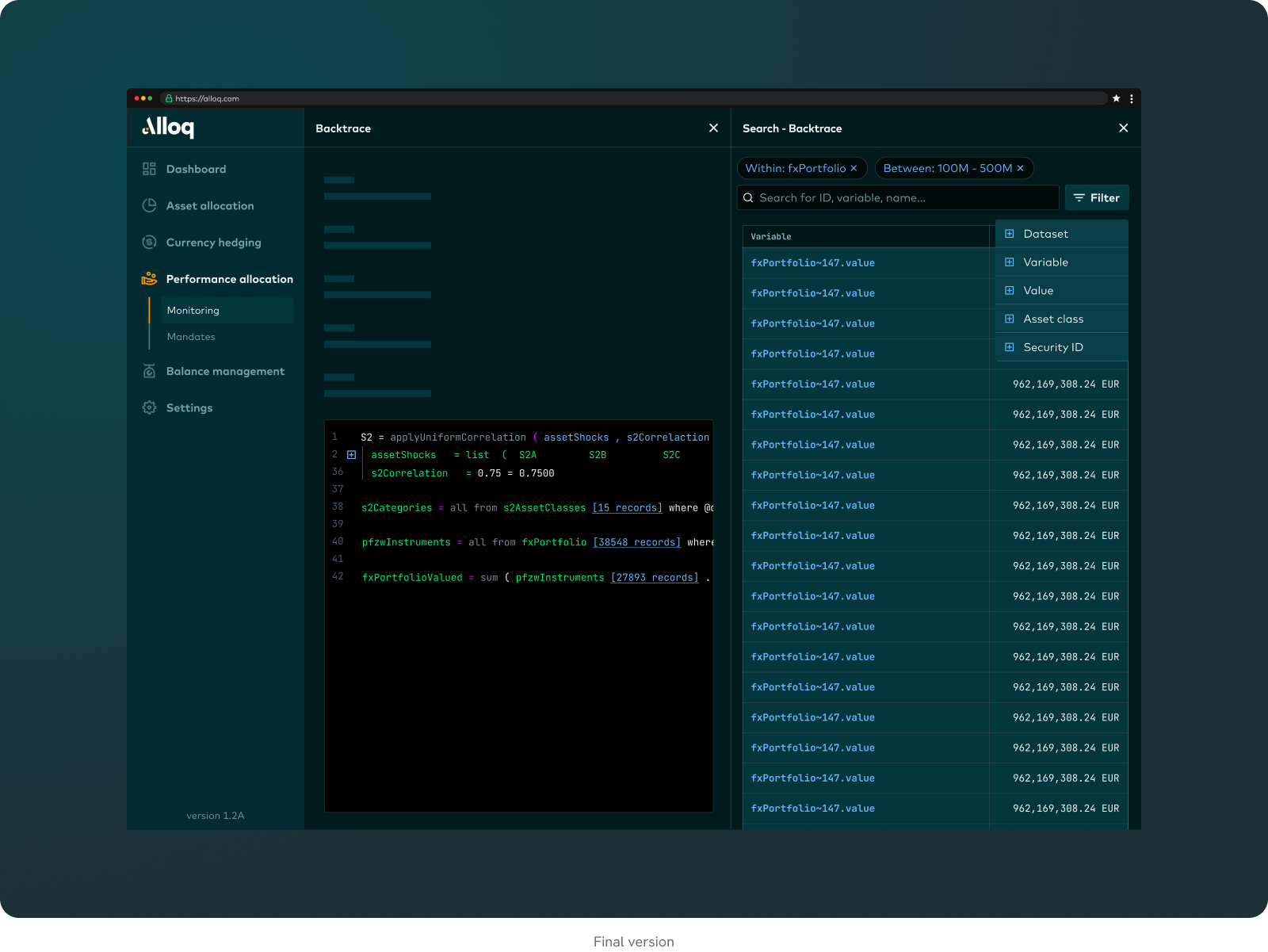
Together with the team and the end-users, we jointly developed an effective solution that is currently still on the backlog but offers significant added value. Ultimately, I created a proof of concept in Visual Studio Code, using the nesting tools. This turned out to be sufficient and intuitive enough to distribute the complexity, also because our end-users have an affinity with Python.
In the existing backtrace, all layers are displayed in the overview. In the new design, only the main rule is shown, which can then be broken down. If the end-user wants to delve deeper into the layer, they can further browse through the relevant rules.
Additionally, the combination of search functionality within the records and the available filters was perceived as a valuable solution by the end-users. This allows them to search specifically for outliers or deviations in the data. The interviews revealed that they often already have an idea of where the deviation is located, and with targeted searching using categories, they can address this more efficiently.
Want to know more about my skillset or work?
Let's start a conversation and I'll tell you everything you need to know.
The SWEX
Year
2024
Role
UI Design
Task
Redesign website
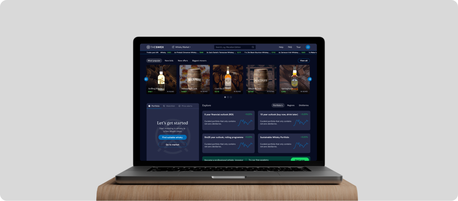
The SWEX is an investment platform focused on trading single malt whiskeys starting at €1000. The platform was initiated by the parent company Scottish Whisky Investment, which supports wealthy parties in investing in whiskey. It offers real-time trading information and prices, as well as the ability to create a personal portfolio.
Assignment
The vision of The SWEX is clear: the platform aims to become the world's exchange for whiskey. The challenge we face is transforming SWEX from a trading platform to an exchange platform.
SWI has indicated that the conversion rate is low and wants to make improvements. There are many inactive accounts, meaning people sign up but then do little to nothing.
I was tasked with developing a conceptual prototype to convince the client of our expertise and optimize the platform. We went through the following steps:
Proces
- Facilitating and participating in brainstorming and sketching sessions.
- Design audit.s
- Market research.
- Wireframes and sketches.
- Developing the concept into an interactive prototype in Figma.
- Preparing the presentation.
- Setting up user tests for the next phase.
Design Audit
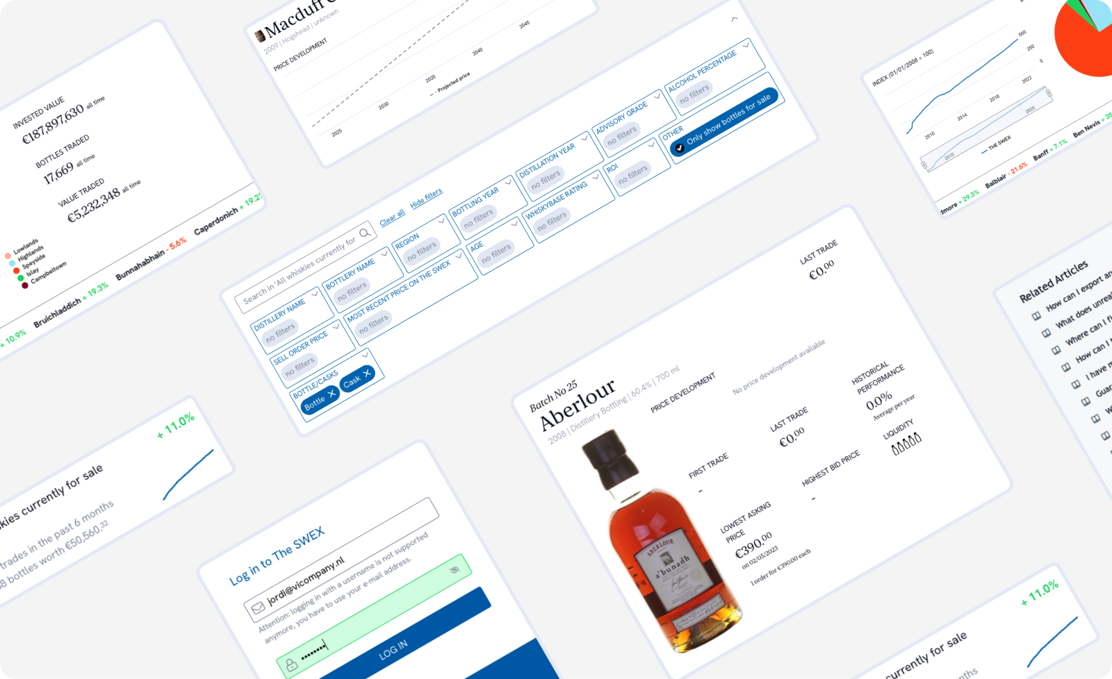
The goal of this audit was to identify opportunities and which elements we can reuse. Additionally, it provided a good starting point for the questions we wanted to validate later. The findings were elaborated in a report and included in the pitch. Some improvement points are shared below:
- Searching and filtering products is quite complex. Does The SWEX have insight into what the end-user needs in their search?
- The user flow of the platform is unclear. After onboarding, there is little guidance to proceed to an investment. What types of users do we have, and what is their goal?
- There is little to no visible trading. The charts are unclear or show outdated data. What can we do to stimulate this market?
Market research
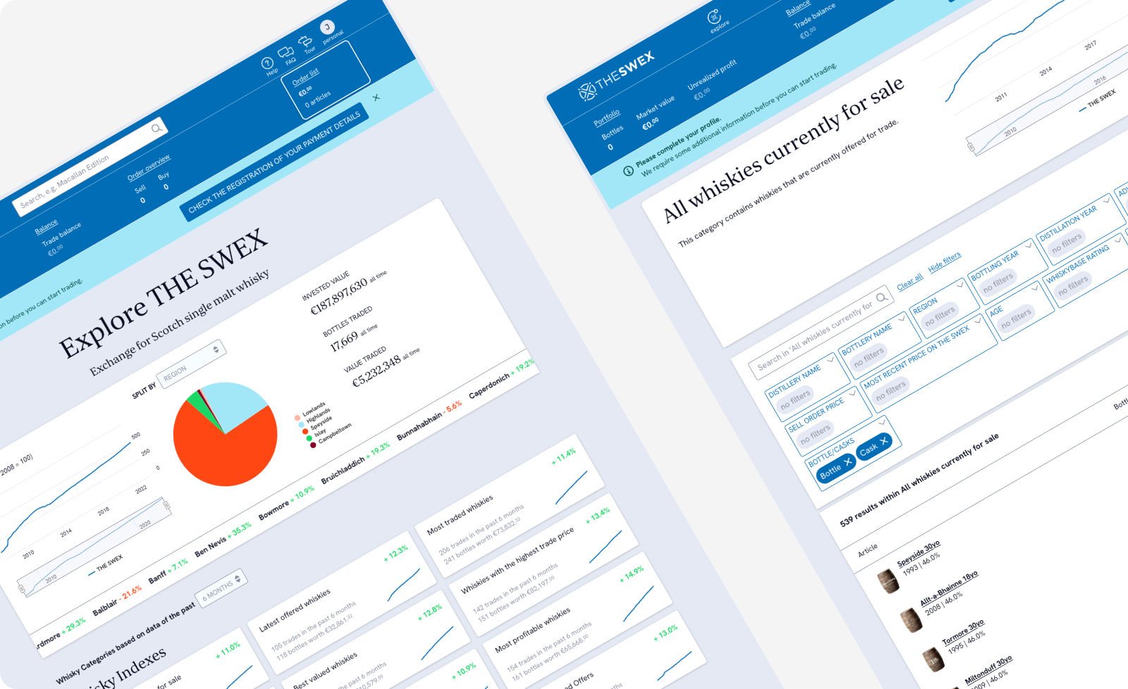
In collaboration with the sales and consultancy team, we analyzed various platforms, delving deeply into the world of whisky investments. In this way, we tried to discover what end-users find important when investing in whisky and how other competitors approach this. I share some insights below:
- The investment is not just about the bottle and the investment, but the packaging is also an important aspect when considering investing in whiskey.
- When investing in alcoholic beverages, there are risks. The SWEX makes these risks transparent and assures the end-user that they will get their purchase back. Think of a failed maturation process or too much alcohol evaporating.
- The trading platforms and auctions show the latest activities, giving the impression that there is real activity on the platform. This is still missing at SWEX.
- We can provide the end-user with more tools to choose the right investment. This could theoretically also result in more liquidity.
Concept
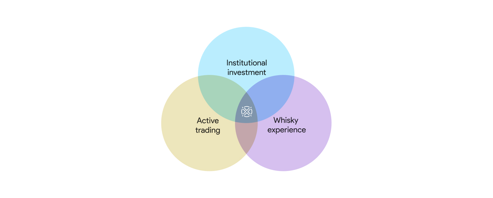
To not go into too much detail, as it is still a pitch, I have identified three core themes for the first version of this concept. We have looked for the optimal combination of these three points:
- Using query filters to support users in delving deeper where necessary.
- Distinguishing between user types and aligning the backtrace display accordingly.
- Simplifying the backtrace by initially hiding complex data and providing an option to delve deeper.
- Providing more clarity and guidance in the backtrace. What do the values mean, and what is the source?
- Developing additional tools to capture a complete workflow when finding a deviation, such as reporting, adding comments, history, highlighting, and sharing links to the backtrace.
In each round, every participant has the opportunity to briefly present their sketch. At the end of each round, we vote on the solutions we see the most potential in. The findings are then documented and serve as input for developing prototypes.
Iterate & validate
In Figma, I developed various sketches, mainly as experiments to explore and assess whether the proposed solutions are effective. Over time, these led to composite versions or even simplified variants. Together with the development team, we chose one of the iterations, which I then tested with end-users.
To approach it from a more holistic perspective, I initially conducted an interview. I wanted to investigate how they previously worked and what they actually consider crucial when tracing deviations. Additionally, I formulated three statements that I wanted to verify.
- Institutional investment Whisky should become an alternative investment for institutional investment companies. This is the vision of The SWEX, and we need to incorporate this into the story.
- Whisky experience Whisky is a beautiful product, but the current platform experience does not allow for this. We strive for the right balance between a financial platform and the whiskey experience. This should be more reflected in the branding.
- Active platform:We aim to guide end-users more actively to the right investments, with the goal of increasing liquidity on the platform and giving end-users the feeling that they are trading on an active platform.
An interesting insight was that although they initially considered the backtrace complex, they found it very useful once they understood it. This insight led to a new iteration, which was again tested with end-users.
Result
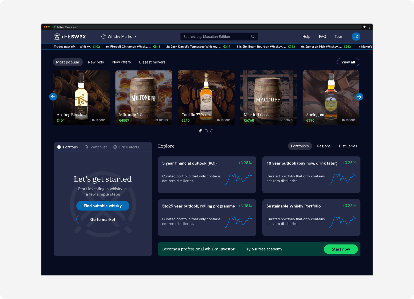
To generate more trading activity, we also wanted to show increased visibility of the trade in the concept. This is reflected in the following aspects:
- Similar to a stock exchange, we have added a ticker to the navigation, showing transactions from the past 6 months.
- Adding the most popular or latest bids/offers in the header to give the end-user a nudge and give The SWEX the option to promote certain whiskeys.
- Whisky’s offered by end-users on the platform are given priority and displayed earlier than whiskeys only managed by The SWEX.
Additionally, we found it important to assist end-users better in finding the right whiskey investment, and we developed various functions for this:
- Originally, the whiskey market was just a button to an overview page. We added a navigation menu to help users get started faster and avoid the use of complex filters.
- A Whiskey Wizard was introduced, where users get a filtered page with suitable whiskey options in a few steps..
- Additionally, we offer the possibility to invest in a "bucket" or view it. This is a fund in which a selection of whiskeys and barrels with a certain theme is included.
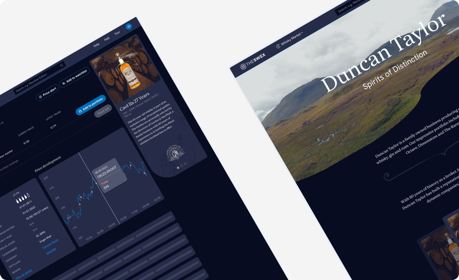
In the end, we created a strong concept that the client became very enthusiastic about. It is a beautiful combination of a financial product and the whiskey experience. Moreover, for the first time, we succeeded in presenting our user research trajectory, including an interview and user tests, together with the discipline.
Want to know more about this project or me?
Let's start a conversation and I'll tell you everything you need to know.
Roparun
Year
2019
Role
UI Design
Task
Redesign website

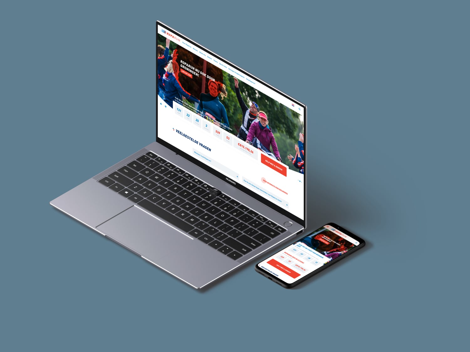
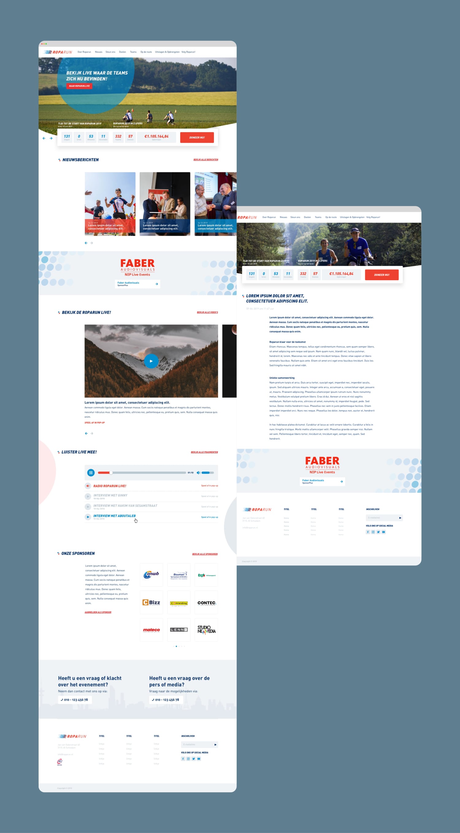
The Roparun is a relay race of over 500 kilometres from Paris and Hamburg to Rotterdam. The teams take part in an athletic event to raise money for people with cancer. The website plays an important role for Roparun. It enables the users to make a donation to their favourite team, to subscribe for the event and to gather information about the event and charities.
Goals & Challenges
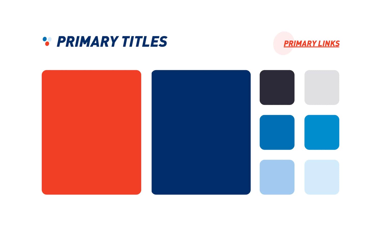
In 2019 the Roparun Foundation created a new corporate identity. Our task was to translate the new guidelines and make a visual redesign of the current website. Within this new design we wanted to achieve more visibility to the sponsors, provide more information to the teams and give Roparun the right set of tools to promote the event. The main goal: collect as much donations as possible.
Proces
- Defining issues and new feature requests
- Analyzing the new corporate identity
- Scavenging Dribbble, Awwwards, CSS Design Awards for inspiration
- Defining a styleguide for the website
- Designing a new homepage in Sketch
- Pitch the new homepage and gather feedback
- Finetuning the design based on feedback
- Redesigning other pages
Result
By redesigning the website and adding new features, the Roparun Foundation was able to give sponsors more visibility. With these tools the Roparun got more sponsors and they contributed to the new donation record.
Also, the Roparun was able to inform the teams with important information via the website resulting in less support calls. Therefore the Roparun could focus more on their main target: getting donations.
Want to know more about this project or me?
Let's start a conversation and I'll tell you everything you need to know.
Rotterdam.
Make It Happen.
Year
2018
Role
UX/UI Design
Task
Concepting • UX/UI

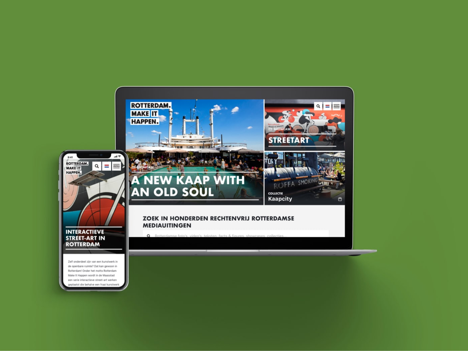
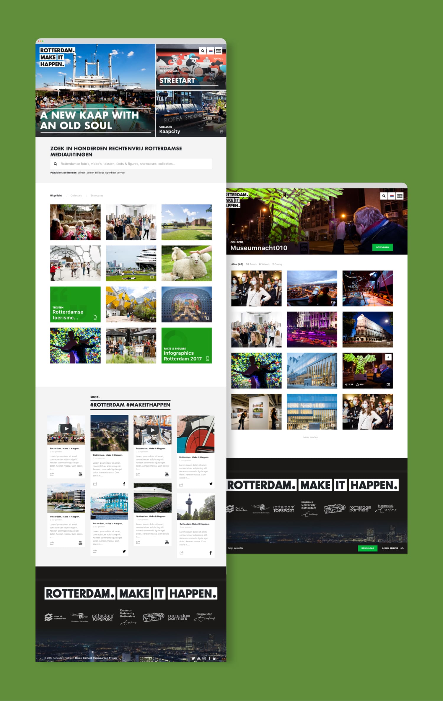
Rotterdam Make It Happen (RMIH) is a collaboration of leading companies that are responsible for the city marketing for Rotterdam. Together they started the Rotterdam Branding Toolkit (RBT) - a platform with thousands of assets to promote Rotterdam.
Goals & Challenges
Our goal was to design a community platform where marketing-, communication professionals and the national press can get inspired and encouraged to promote Rotterdam in a consistent matter. We started with research and created persona's and customer journeys to define the users and opportunities.
We started with research and created persona's and customer journeys to define the users and opportunities.
Process
- Defining issues, online strategy & corporate identity and analyzing data
- Creating Persona's and Customer Journey to define the users and opportunities
- Scavenging Dribbble, Awwwards, CSS Design Awards for new idea's
- Creating features & creating the concept
- Designing the userflow, sketching some wireframes and make the idea visual
- Pitch the concept in a slick keynote presentation and gather feedback
- Redesigning the concept if necessary and designing the remainder of the platform
- Prototype in Craft/Invision
- Usabillity testing
- Finalizing designs
Result
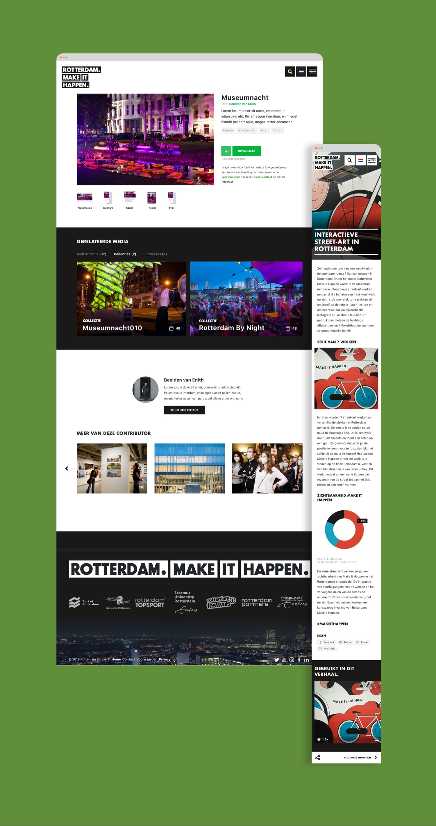
We designed a platform where the client could show the users how they can promote the city by making Showcases. These showcases are build with the assets that the users can download and utilize themselves.
The goal is to show how you can promote Rotterdam with the available tools and assets. Each showcase shows what assets have been used. In this way, we try to encourage the user to make their own story. The user can then promote the story on social media which eventually appears in the social media feed on the homepage of the platform. The social media items are the end result of the platform and are also used to inspire the users again.
A new feature of this platform is to make collections. Each collection contains a set of media objects (like text and images) with a similar theme. It is a category that enables users to download a full collection of text, images and video's to encourage and help the users to set up a good promotional story with a single click.
Want to know more about this project or me?
Let's start a conversation and I'll tell you everything you need to know.
Creatings Stories
Year
2019
Role
UX Design
Task
Designing a travelplatform
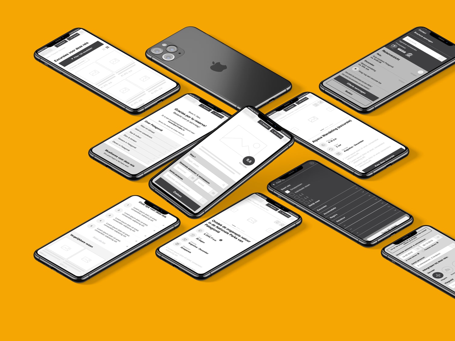
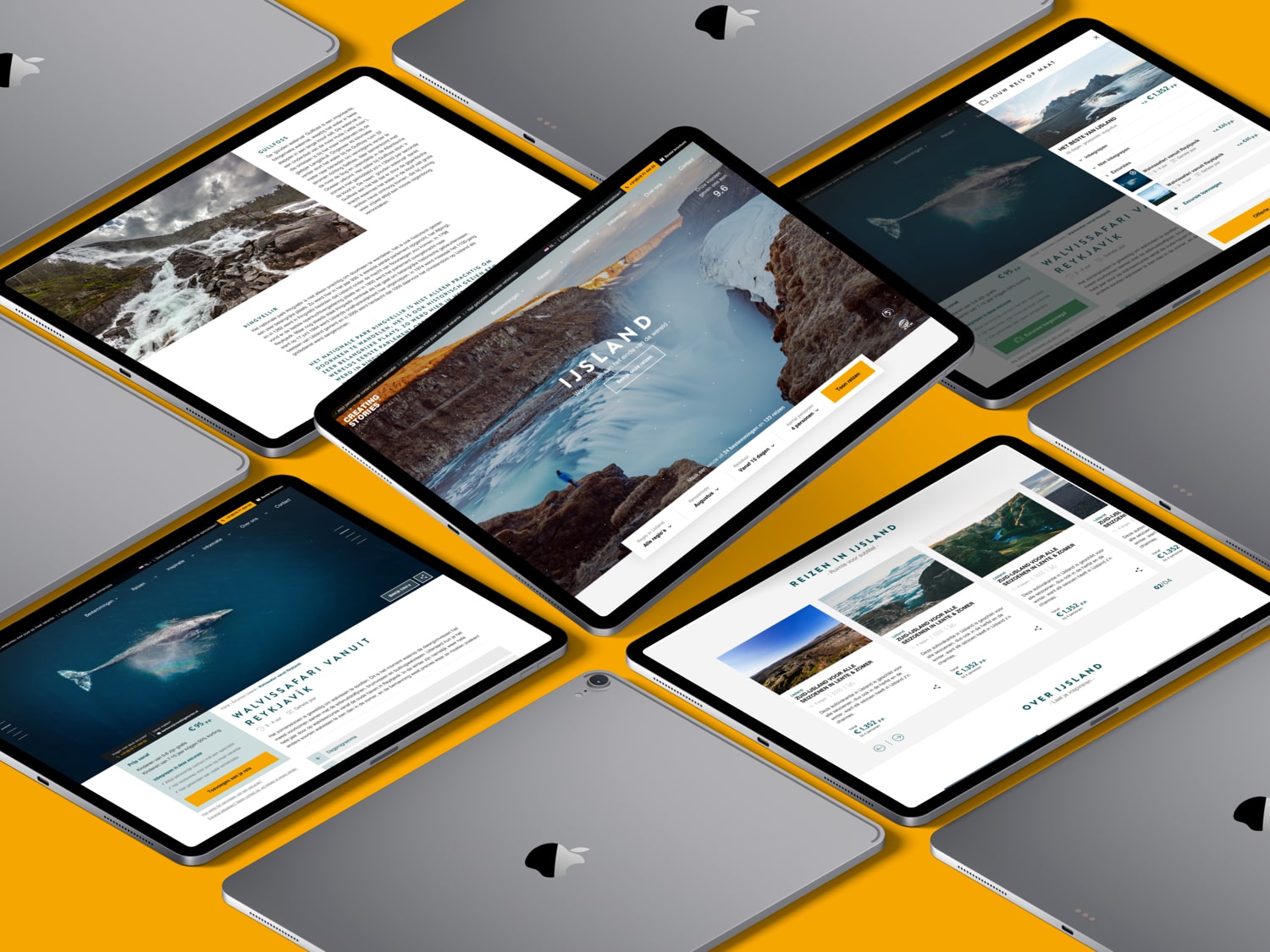
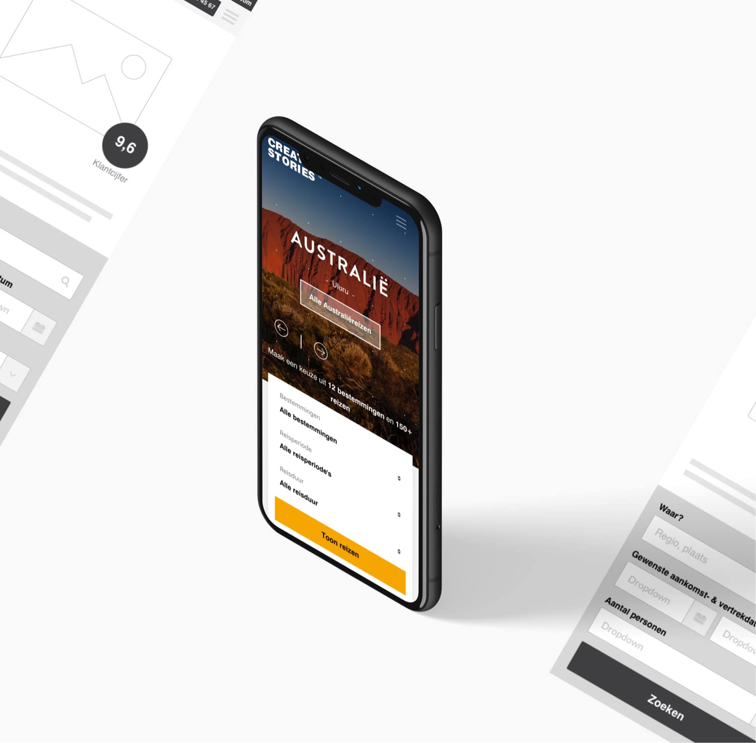
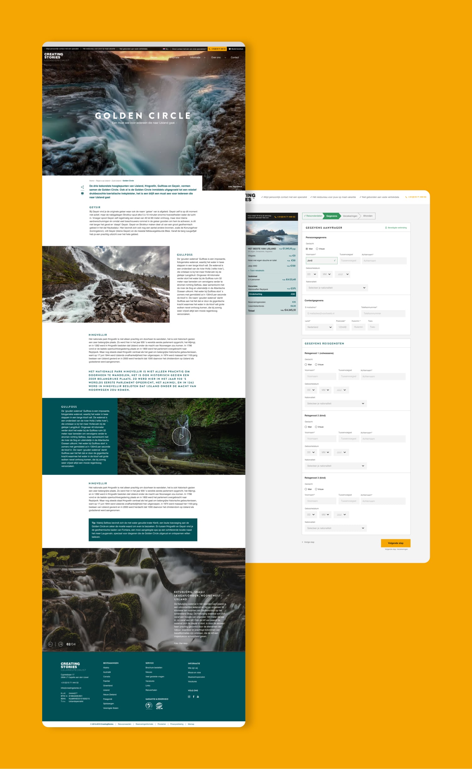
Creating Stories is a travel agency specialized in creating a custom holiday in 12 different destinations. As the company is growing they needed a website that could fit their ambitions. Together with Carnero Mediadesign we redesigned the complete UX.
Goals & Challenges
Our goal was to create a website that enables customers to book their custom holiday online. Besides that the website also needed to improve the internal workflow within Creating Stories. Their current websites (all separate websites) were a bit outdated but had a good SEO rating. Our challenge was to guard that SEO rating and make sure that we have enough flexibility to migrate the different websites.

Proces
- Collecting information and defining issues
- Determine userflow
- Scavenging Dribbble, Awwwards, CSS Design Awards for inspiration
- Wireframes, wireframes, wireframes
- Clickable prototype in Sketch
- Pitching in a slick keynote
- Testing with the users
- Collecting feedback
- Finetuning wireframes and userflow
- Designing the visuals - mobile first
Result
Together with Carnero we created a multi-site where users can book their custom holiday. Also, Creating Stories now has the right set on tools to make a strong organic website and improve the internal workflow.
Want to know more about this project or me?
Let's start a conversation and I'll tell you everything you need to know.

About
I am described as a pragmatic and driven UX/UI designer, a team player who thinks proactively. I gain energy from translating complexity into simple solutions or creative concepts.
I also enjoy working in Figma all day, optimizing components down to the smallest details. I prefer working on both UX and UI and am flexible across various areas.
Skills
Want to know more about my skillset or work?
Let's start a conversation and I'll tell you everything you need to know.


